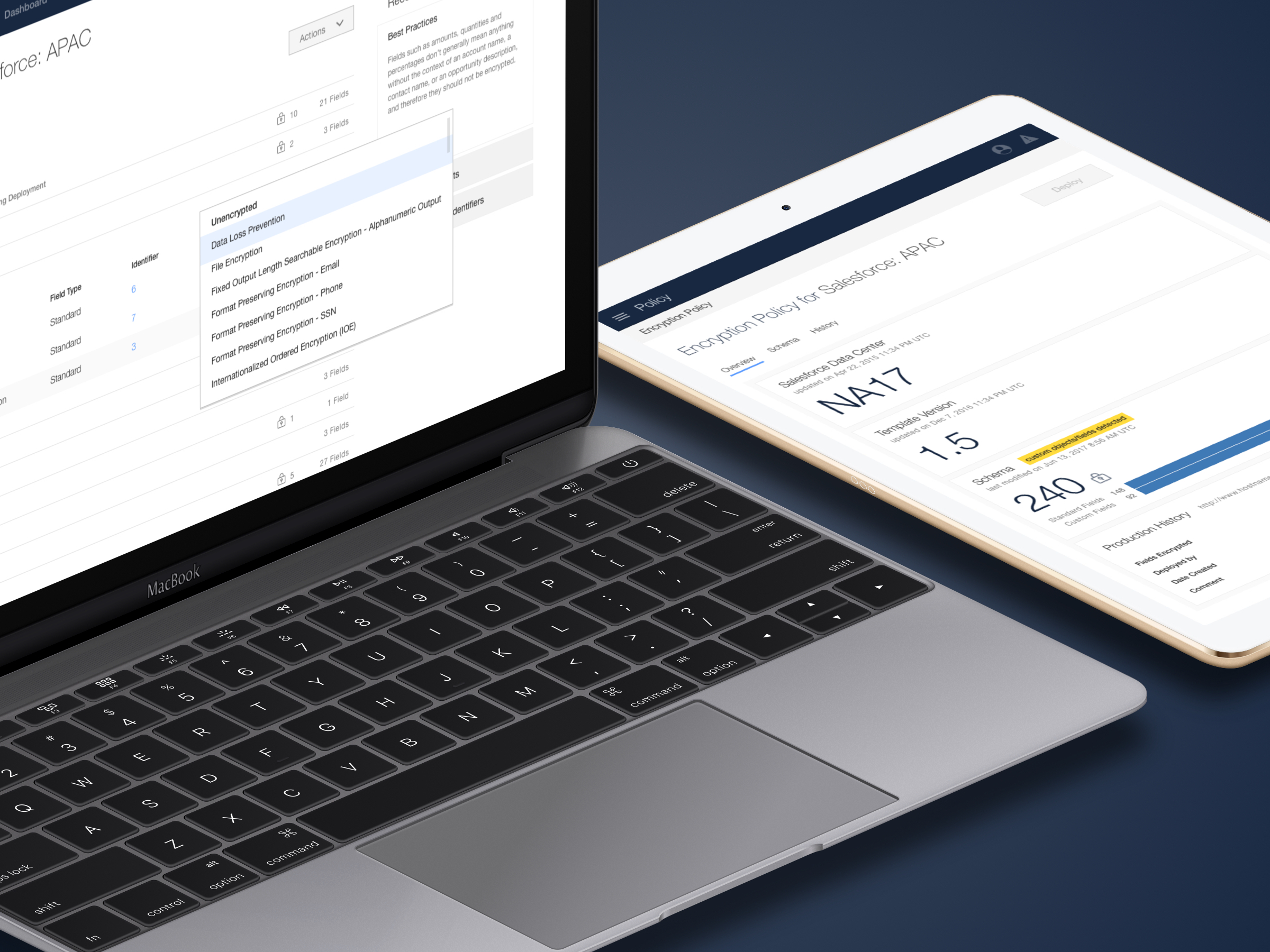
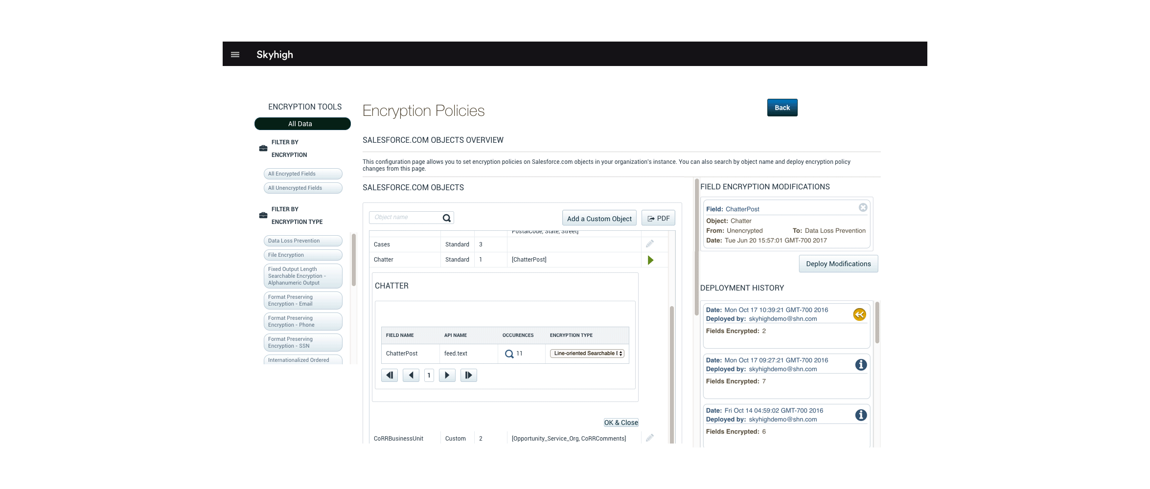
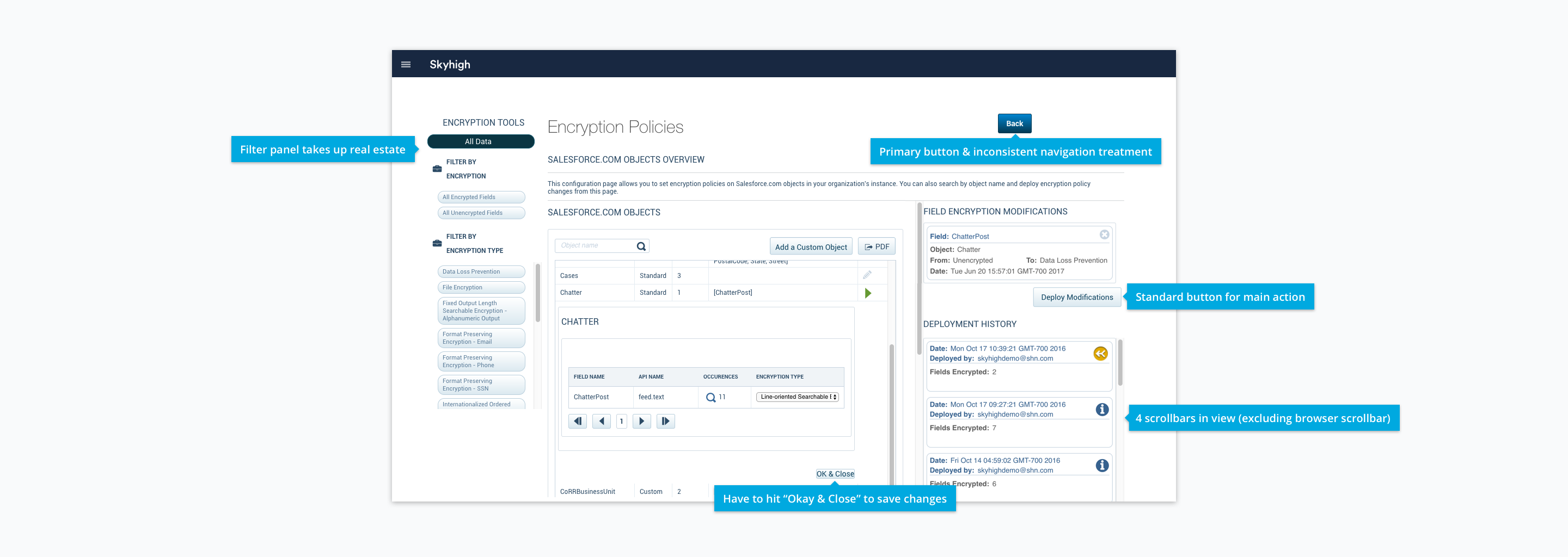
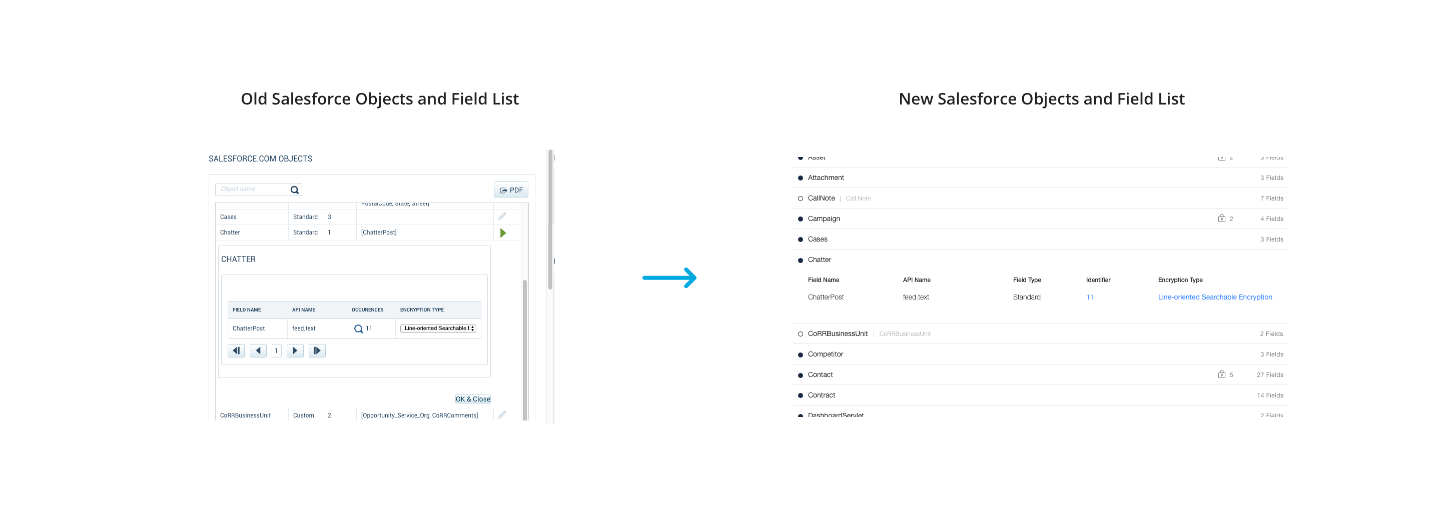
Although security admins knows what information they want to encrypt, they aren’t sure how to encrypt in a way that doesn’t break Salesforce’s functionality. This uncertainty results in long, tedious calls with our support team. Our previous UI (pictured below) addresses the customer’s need to encrypt Salesforce objects and fields, but it doesn’t provide any guidance, which causes a lot of frustration for the user.
Redesigning Encryption Policy has always been discussed, but it was never prioritized. Because there were many short-term fixes applied to the page each release, Encryption Policy slowly became Frankenstein’s monster. When the VP of Product restructured the product teams, the UX team also shuffled responsibilities, and Encryption Policy finally received its moment to undergo a redesign.
To understand the state of Encryption Policy, I talked to my teammates who had made minor modifications to the old UI.
Next, I began auditing the current design and identifying any interactions to gain an understanding of how the customer feels and what challenges they may go through when using Encryption Policy. I also interviewed our sales and support teams to gain more insight on how our customers use Encryption Policy, what the pain points are, and what improvements could be made.
Comparing my notes from the interviews and my audit, I learned the user
Addressing these takeaways will improve the customer’s experience of configuring Encryption Policy for Salesforce.
As I kept the findings in mind, I explored the directions below.
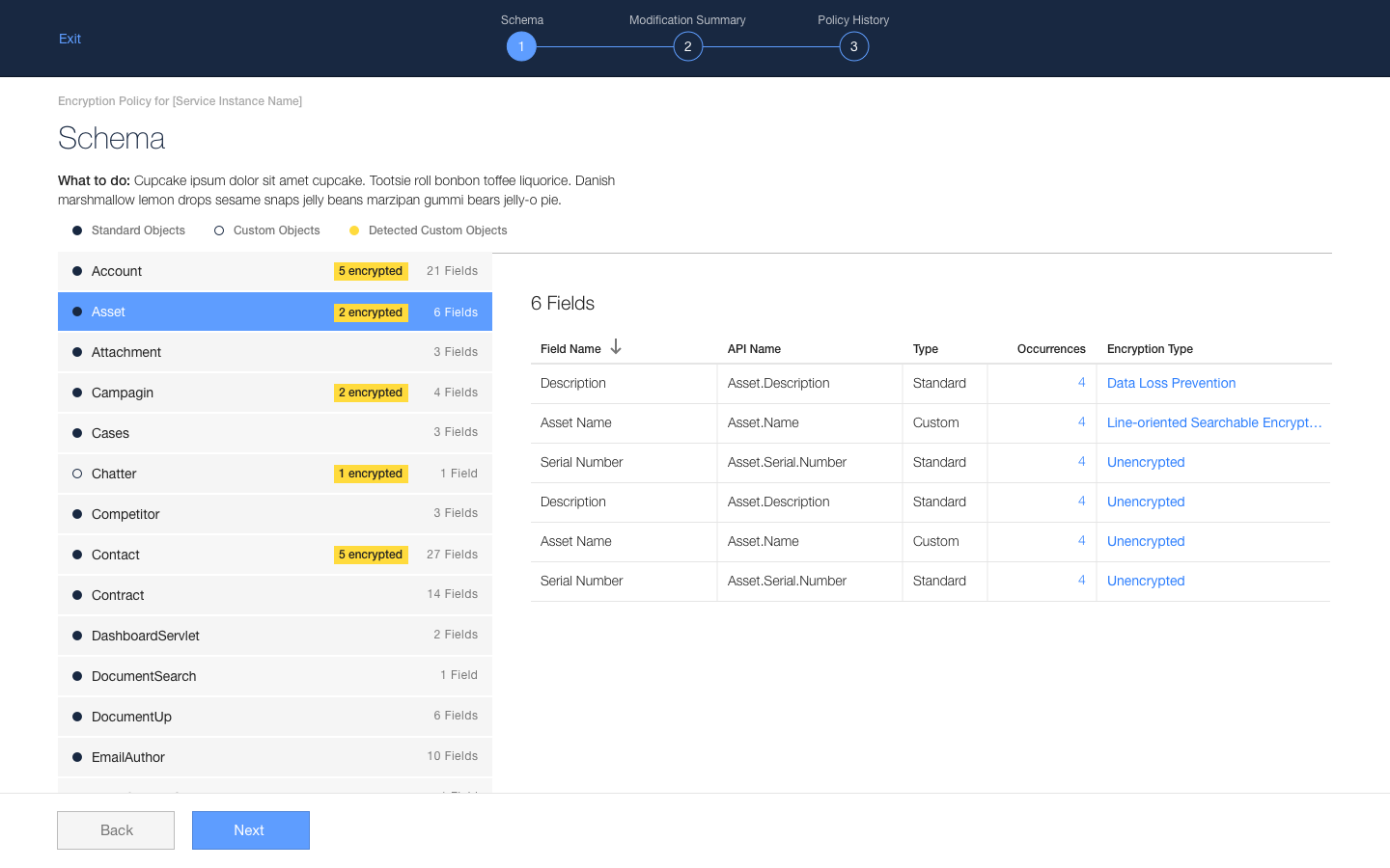
I initially explored a wizard because I thought a series of well-defined steps prevents the user from forgetting to deploy their modifications, and it may help the user know what to do.
However, I didn’t pursue this direction further because the wizard’s constraint added complexity when adding custom objects, which might disrupt the user’s workflow.
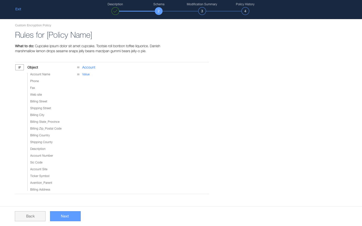
My design teammates and I thought about how might we be able to incorporate Encryption Policy with the other policy pages we have in our product. I explored using a component we created called Rule Builder, which is a set of “if… then” conditions (e.g. the user creates a policy like “If a file contains social security numbers, then quarantine file”). Since the same persona handles Encryption Policy and the other policy pages, I wanted to use this component because it is a familiar tool, and it creates consistency across the product. Moreover, engineering doesn’t need to create something new, so it also saves time building the redesign.
However, I didn’t pursue this direction because Rule Builder does not give the list flexibility to expand or collapse Salesforce objects, which may cause cognitive overload on users.
With the ideations tucked away in another Sketch file, I eventually arrived to a solution that addresses the findings.
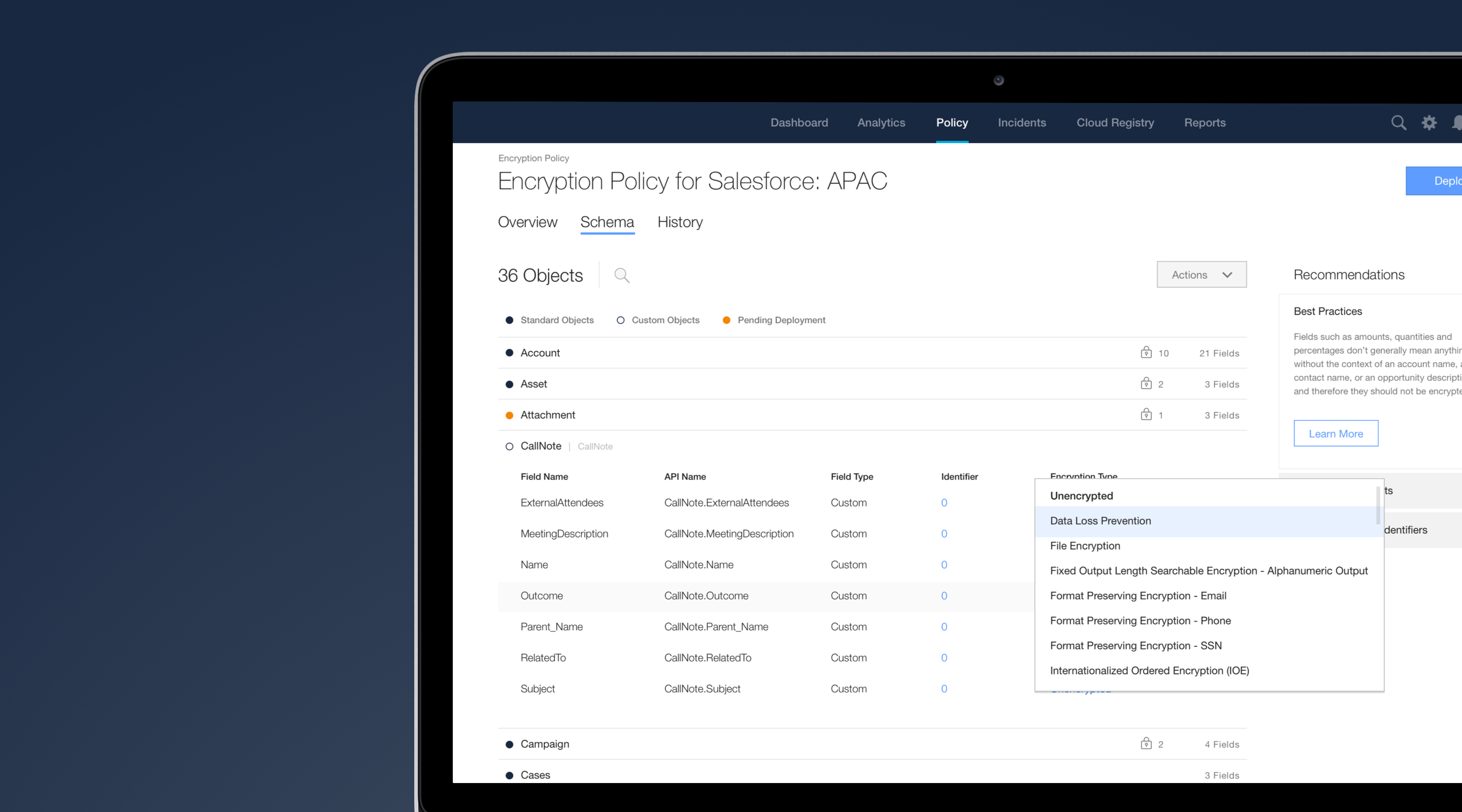
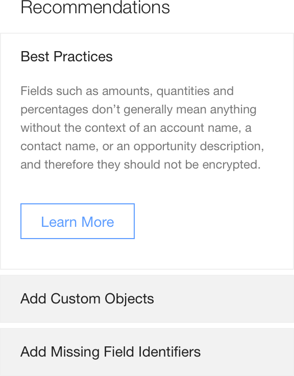
As mentioned before, the user doesn’t know what are the best encryption options to apply to their organization’s information because there are no definitions or explanations for each encryption option. They need to heavily rely on our support team. Although we have a help page defining each encryption option, it is not easily accessible in the UI. To alleviate these problems, I added a Recommendations panel that lists best practices and provides easy access to the help page. The panel also gives some guidance on what other actions the user can take to leverage Encryption Policy to its fullest.
The most frequently mentioned pain point for the user is the excessive amount of scrollbars in view. There are scrollable containers within another scrollable container, which makes the Salesforce objects and fields list difficult to navigate. From a visual perspective, keeping the list contained does not effectively utilize the real estate.
To help the user view the list better and perform their task, the containers are no longer contained in scrollable panels. The list behaves like an accordion so as not to overwhelm the user with multiple expanded sections.
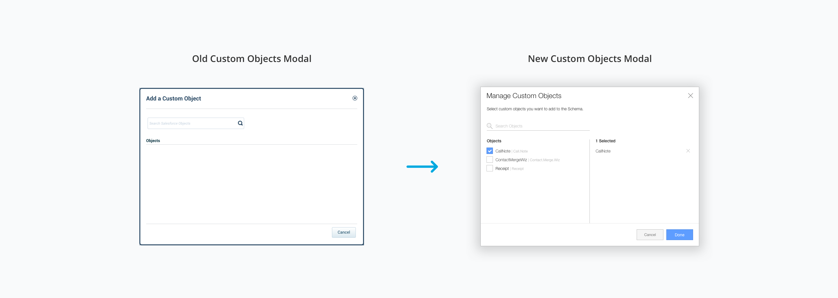
A feature many customers have requested is adding custom objects because they wanted to encrypt them but there was no way to do so. Around the time of the redesign, we pushed an update that allowed customers to manually add custom objects, but it still had some issues.
In the old UI, adding custom objects gives you a blank model with no explanation. There is no CTA (call-to-action) that tells the user what actions they can take. The new modal presents a list of all the detected custom objects found in their Salesforce account. Now, the user doesn’t need to know the name of the custom object off the top of their head.
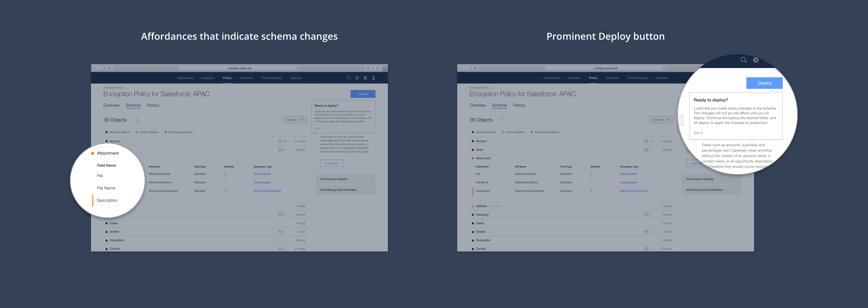
Users need to deploy their changes for the encryption types to be enabled and updated. Unfortunately, they often forget to deploy. To address this, the deploy button is inactive when there are no changes in the list, and active when there are changes. The stateful button aims to draw the user’s attention when they have Salesforce fields ready to be deployed.
In addition, users configuring Encryption Policy for the first time will see a tooltip that explains its function. Not only does the tooltip provide helpful information, it helps draw the user’s attention to the deploy button’s location. There are also label states and an affordance when changes are made to provide visual cues for the user of any pending items.
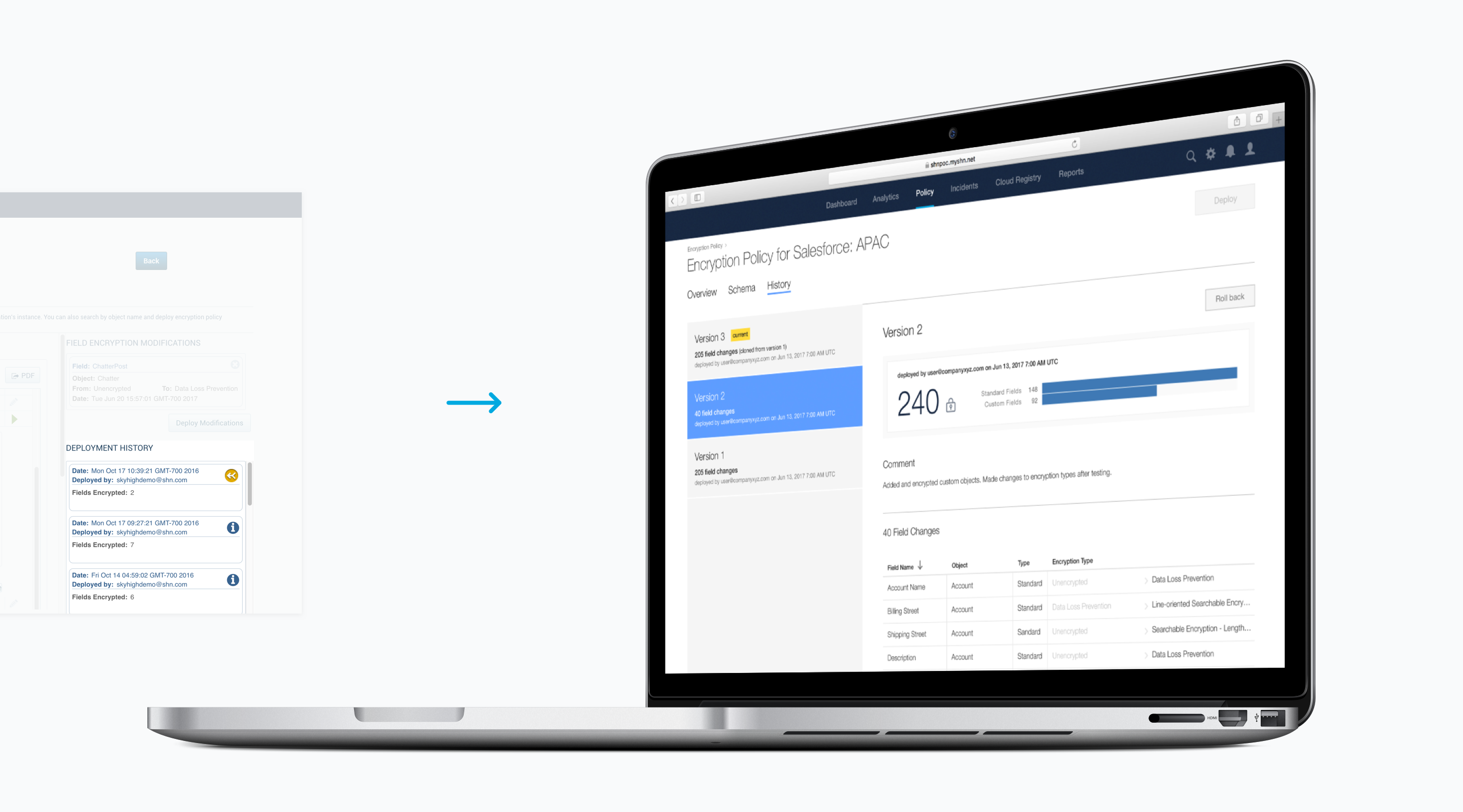
Lastly, the deployment history is now to a separate tab to declutter the UI, so the user can focus more on the Salesforce objects and fields list.
After 5 months, we shipped the feature. The PM and I heard back from sales who said it took him less than 15 minutes to set up Encryption Policy whereas before it would take hours to set up. Although he was not our main user base, it was still rewarding to hear from a stakeholder that the experience improved.
Before beginning this project, I had assumed a redesign meant “re-skin,” and that the purpose of the project was to update the look of the UI, similar to giving it a makeover. Looking back, I laugh at my ignorance. I learned that a redesign means an opportunity to look at how the product works, discover what changes could be made to create a better experience for the customers, and how might these changes affect the overall product experience.
To say this project ran smoothly is a lie. In fact, I painfully learned that I needed to represent and communicate my designs to engineering during handoff to prevent unnecessary iterations on their side. Because the engineering team is in India, there was a lack of communication in the beginning of development, and engineering began building without including me in the conversation. Thankfully, we managed to get in sync, and communication improved between us after we discussed the issue during our retrospective. This incident made me realize transparency and open communication among teams are important factors to successfully ship a solution.