Design Systems

Snapshots of style guides and component libraries I established/contributed to boost collaboration across teams, ensure the products are meeting accessibility standards, and create a cohesive brand.

Credit Sesame

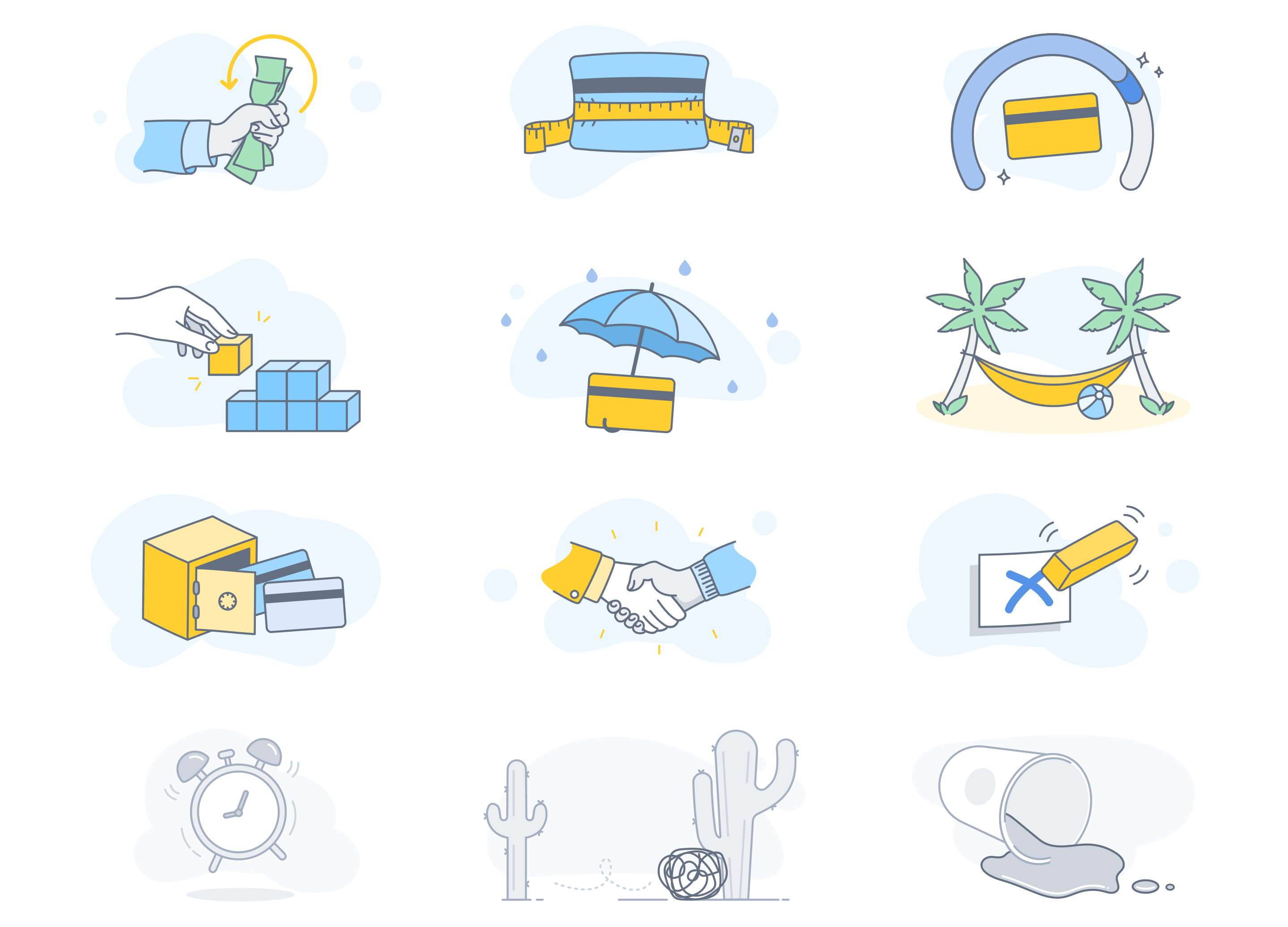
I was responsible for creating, updating, and maintaining Credit Sesame’s new product design language. I worked with a designer in building out a color system where we defined the usage of each color band, and ensured that they met AA accessibility standards. I facilitated conversations around defining the illustration system. I also documented component usage guidelines, visual specs, and interactions for developer handoff.

Credit Sesame's color system broken down to primary, secondary, tertiary, and neutral. Each swatch has a variable and hex code.
photo of clustered post-its with attributes to define Credit Sesame's illustration systemCredit Sesame's illustrationsCredit Sesame's illustration restrictive palette (light blue, blue, and yellow).
example of component documentation
PayPal

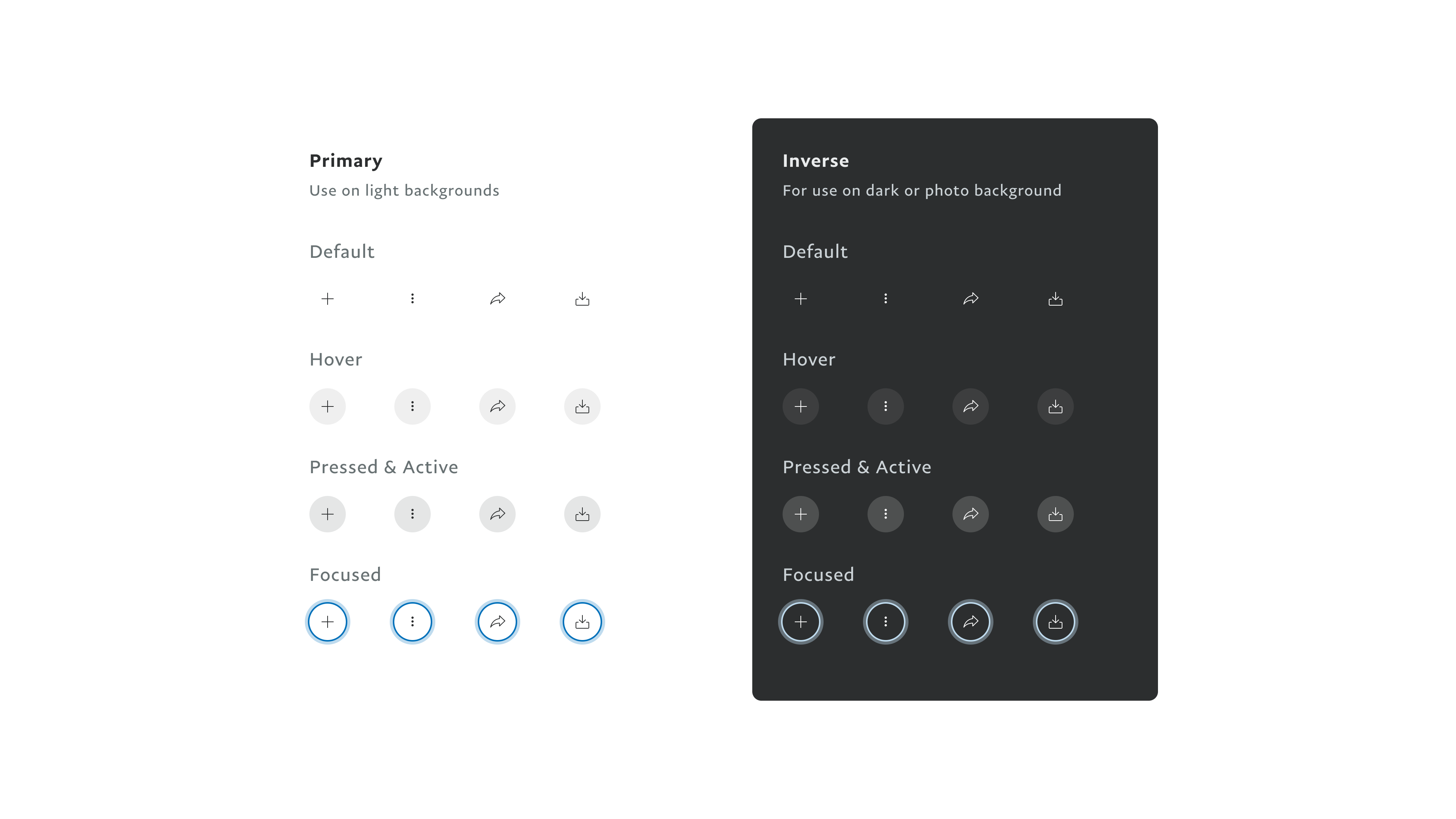
PayPal partnered with an agency to redesign the visual system for the consumer product on mobile platforms. This partnership was a stepping stone to giving the design system a fresh new look that would later be adopted for the enterprise product, and span across web and mobile. One of the patterns I worked on is Icon button.

PPUI 1.0's icon button in all its interactive states. The primary icon button style is on the left, and the inverse icon button style is on the right.
The agency’s proposal of the icon buttons 2.0.
PPUI's 2.0 icon buttons broken down into primary, secondary, secondary "inverse," tertiary, and tertiary inverse. Each style has default, pressed, hover, and focus state.
Bright Live

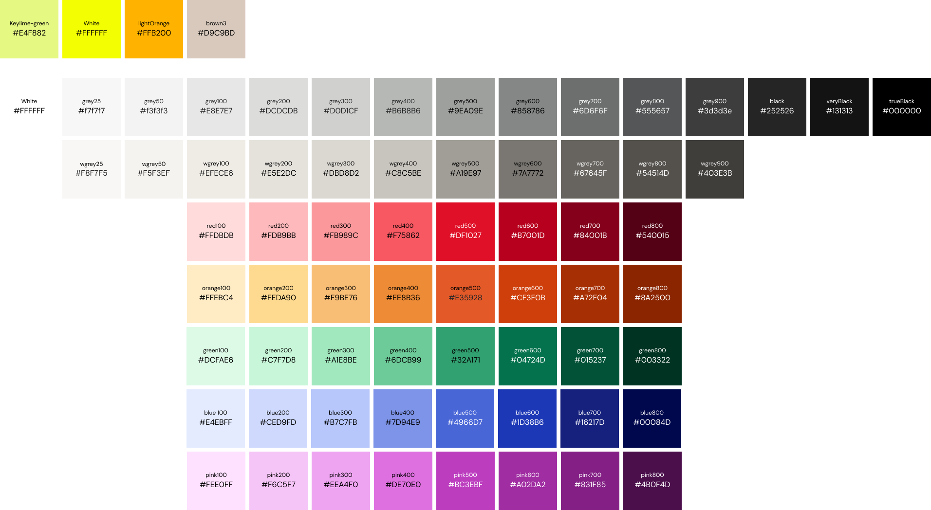
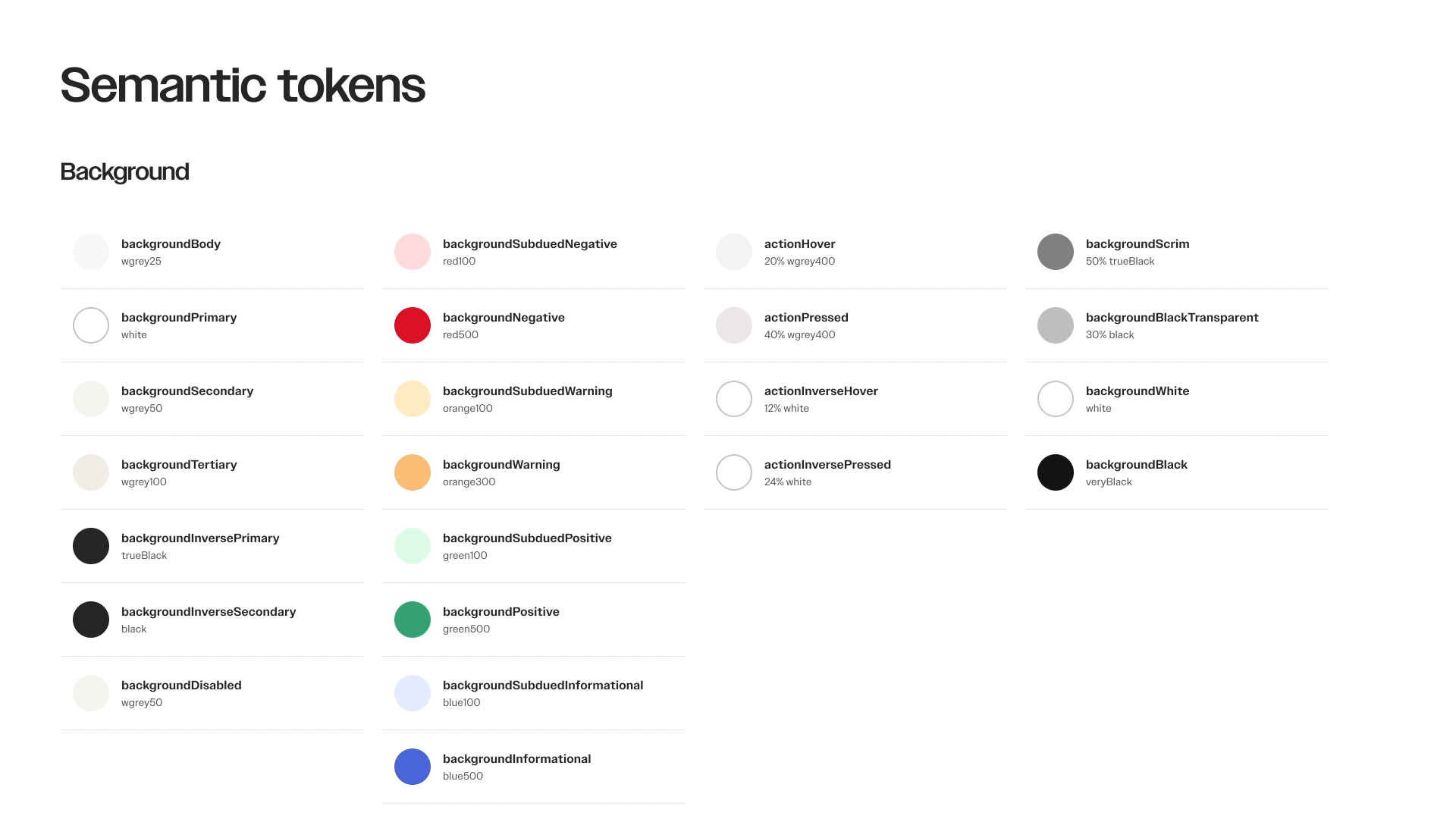
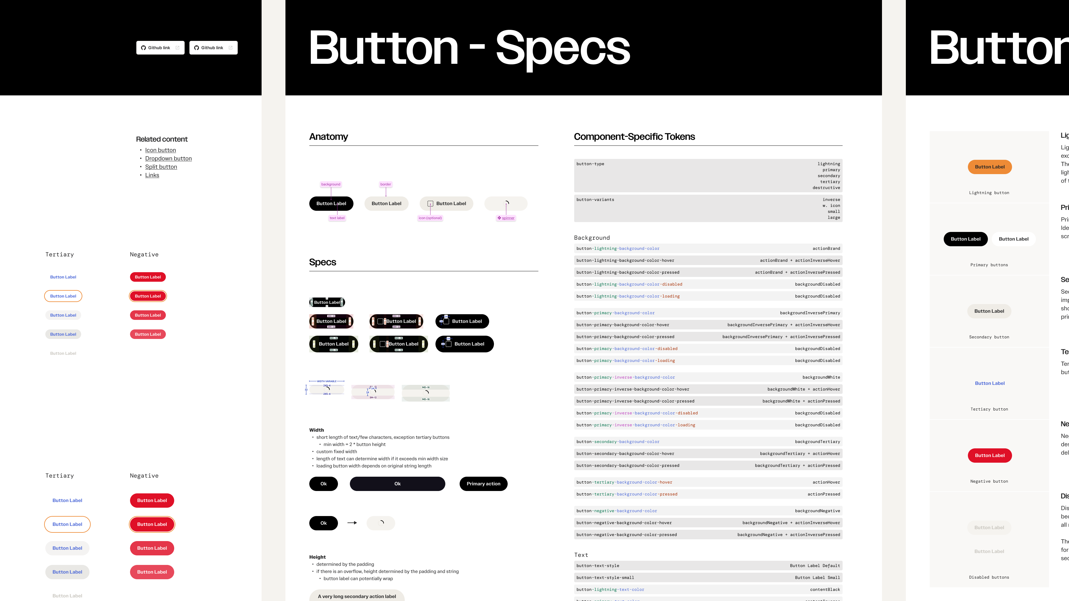
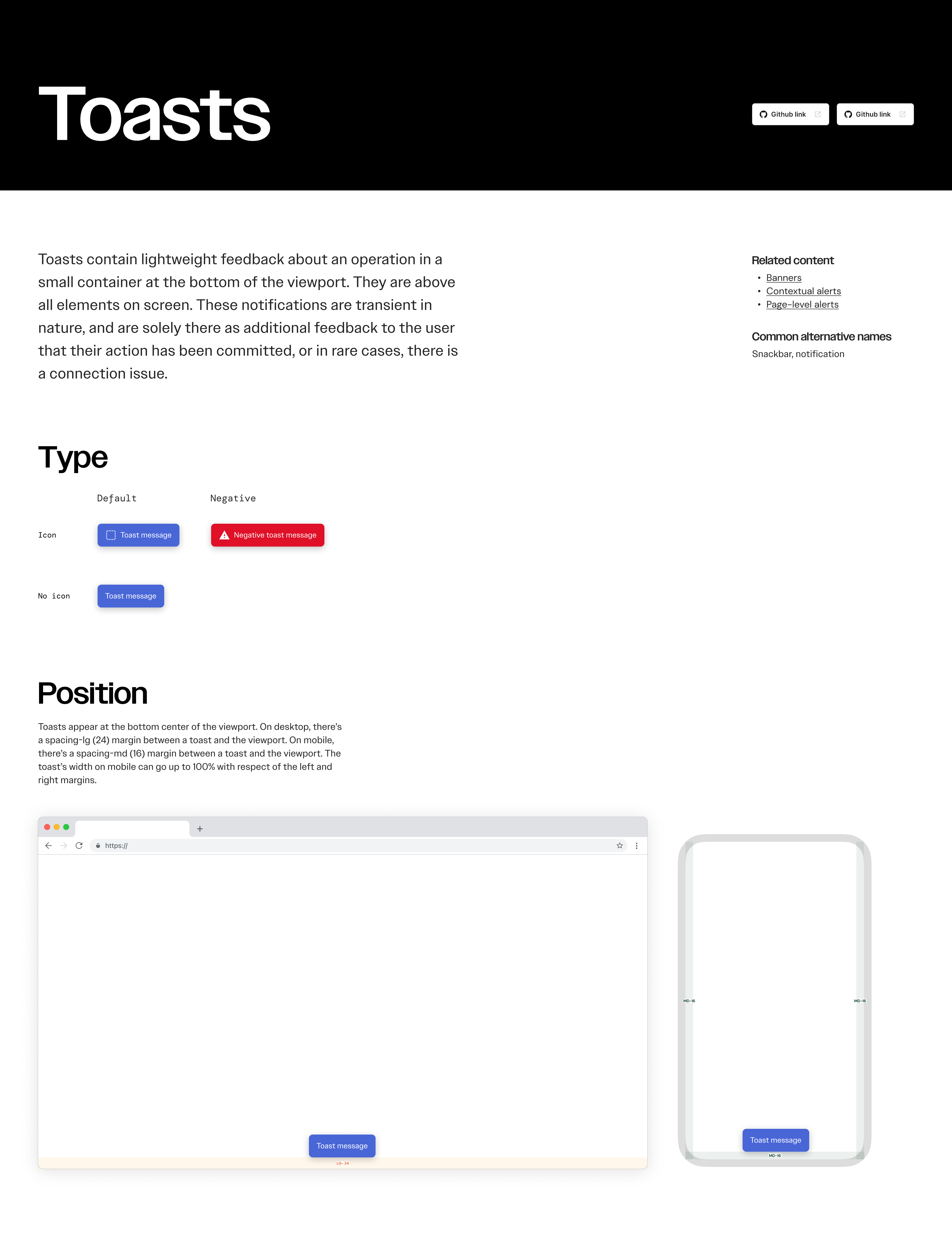
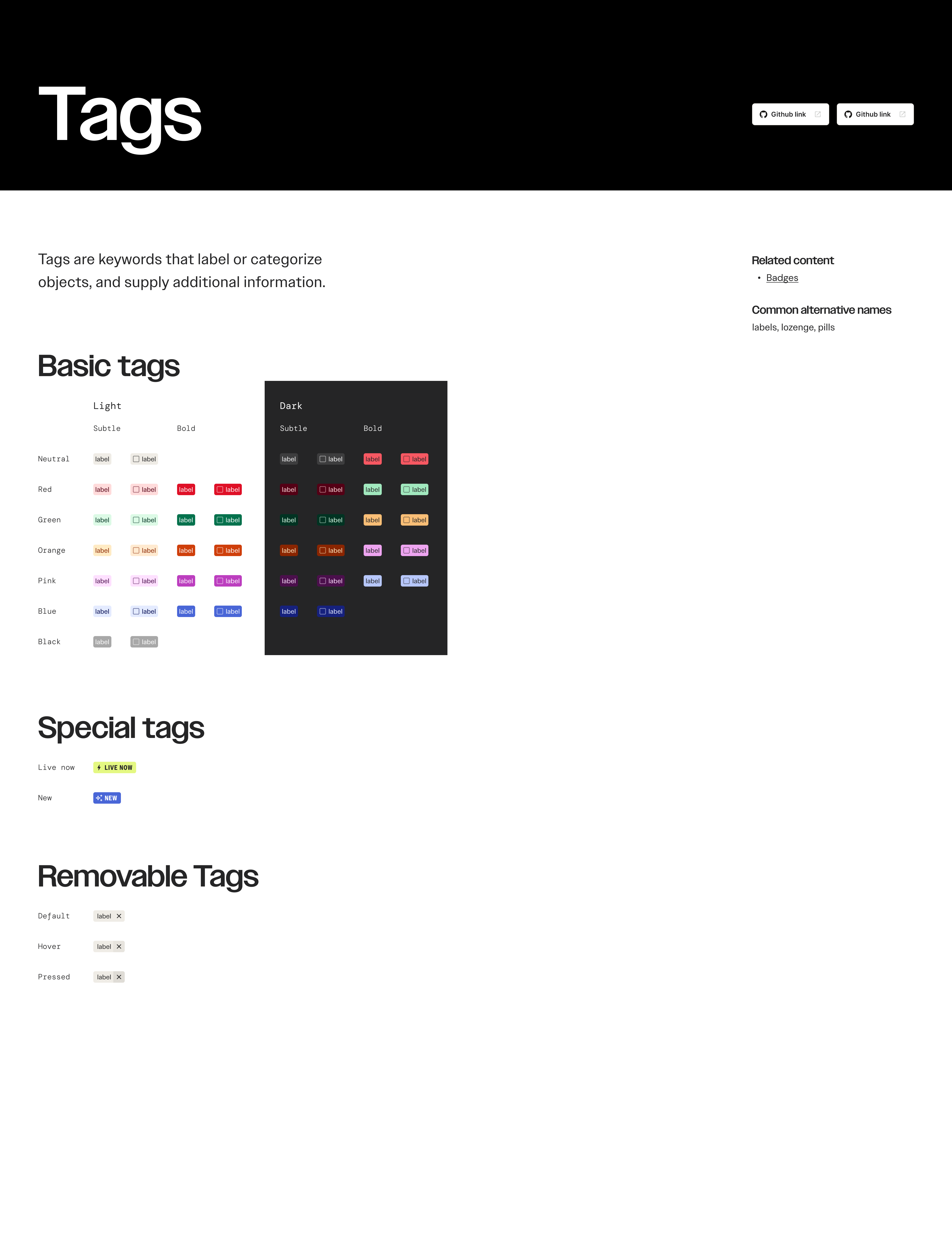
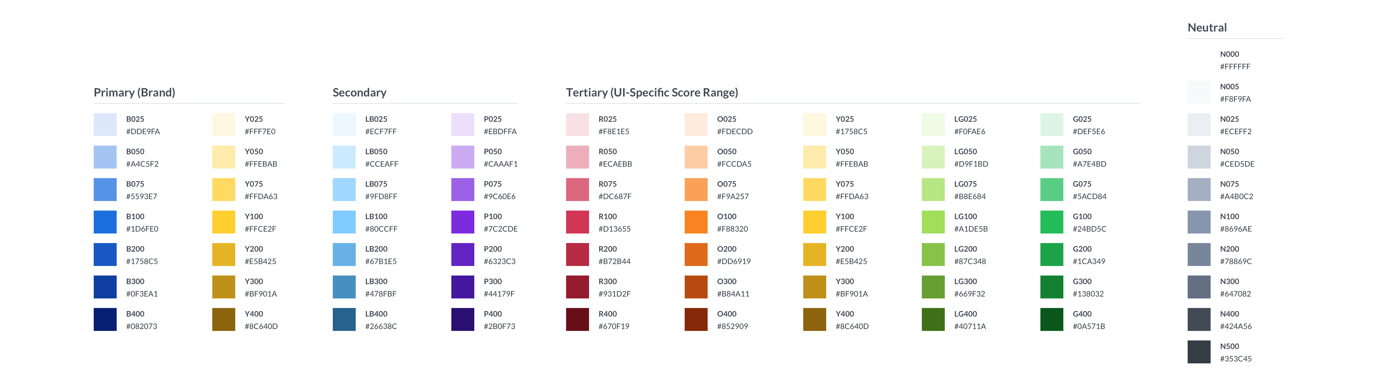
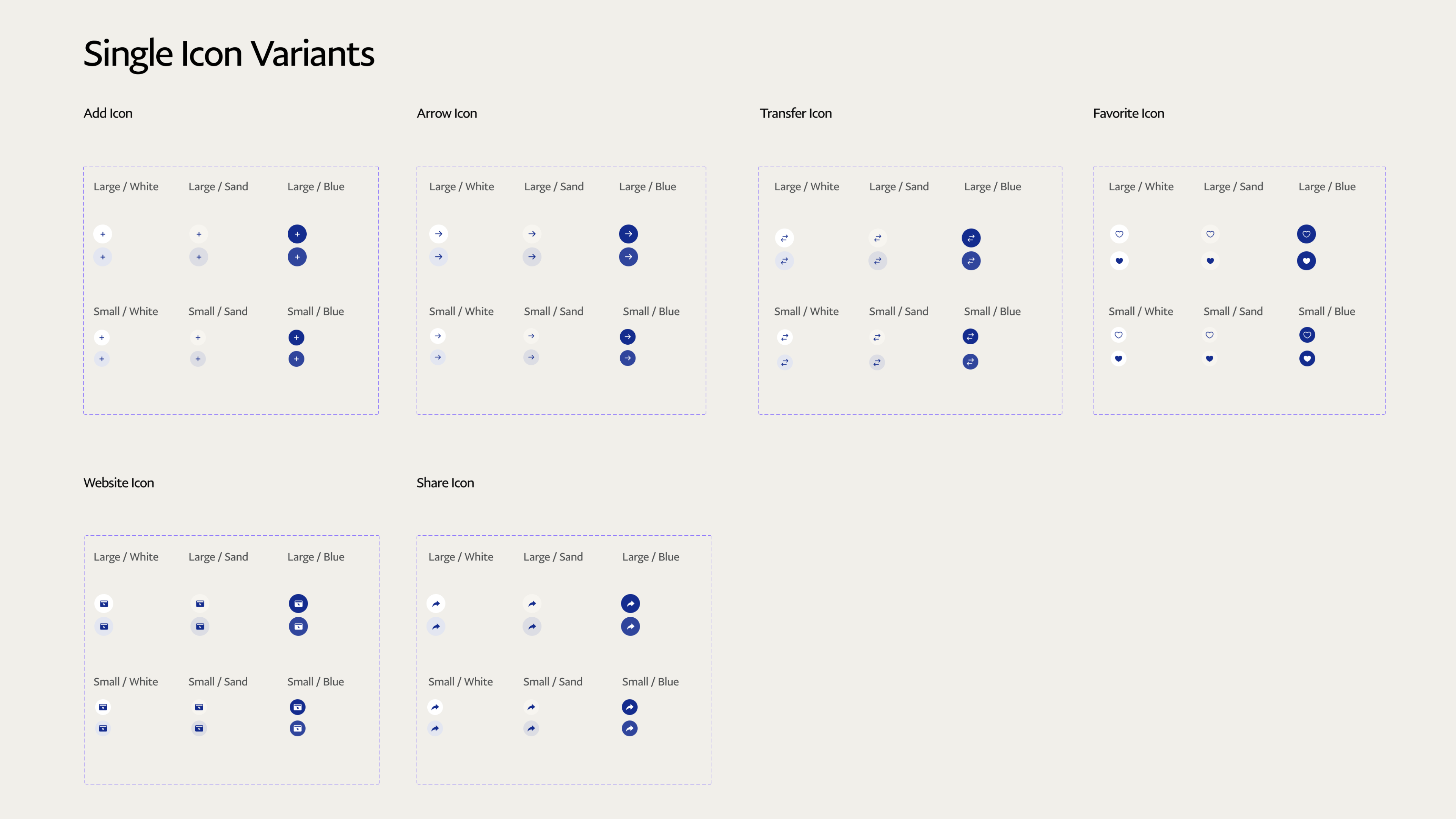
I led Bright’s product design system, Bagherra, and worked with engineering to tokenize and build our foundation—color, type, etc.—to support light and dark mode for web and iOS.

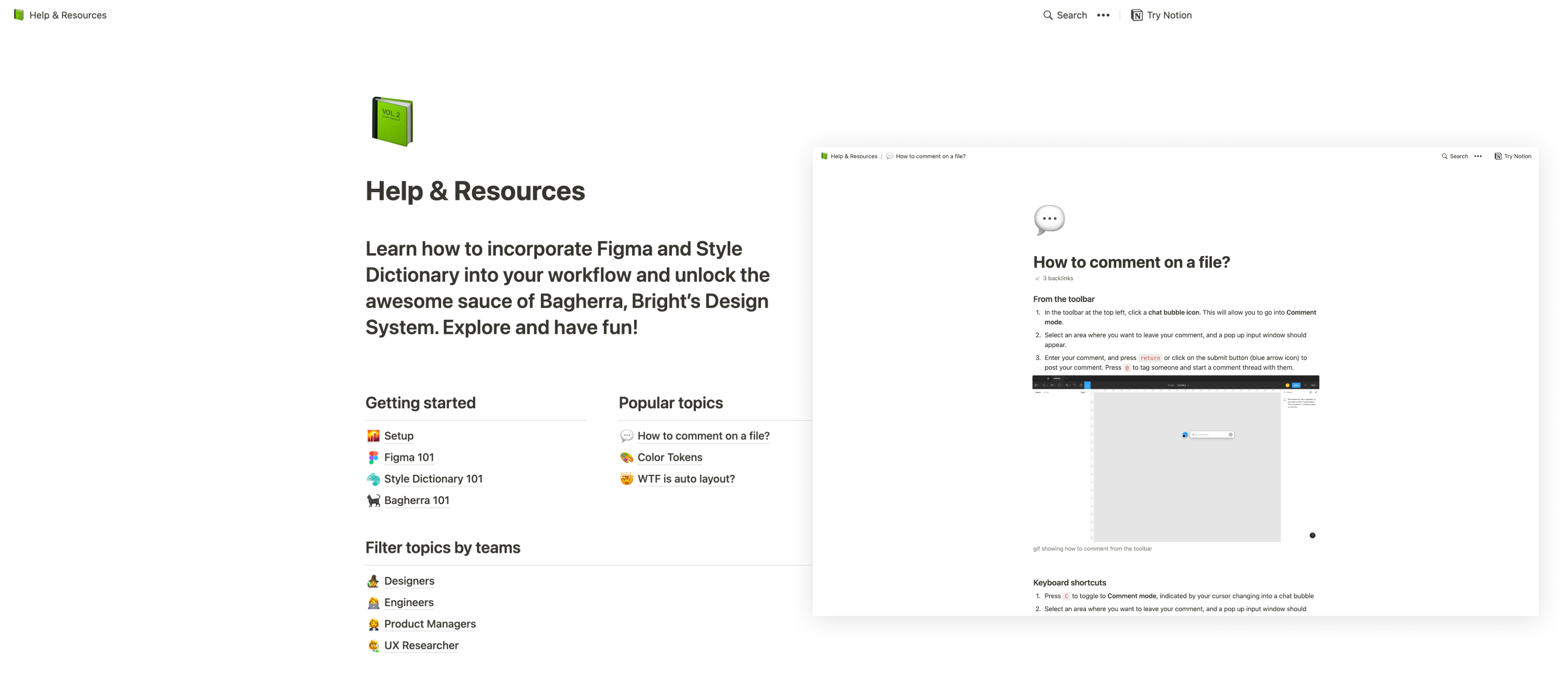
I also created an educational resource hub to improve collaboration cross functionally, and familiarize teams with Bagherra and other internal tools.

Bagherra's color base tokens laid out in a colorful spectrum. 
The first row contains brand-specific colors. The second row contains white, the greys, and blacks. The third row contains the warm greys. The fourth row contains reds. The fifth row contains oranges. The sixth row contains greens. The seventh row contains blues. The last row contains pinks.
Bagherra’s base color tokens
Gif of background color semantic tokens in light and dark mode
Bagherra’s background color semantic tokens in light and dark mode
screenshot of Bagherra’s Button component, specs, and usage guidelines in Figma UI Kit.
screenshot of Bagherra’s Toast component in Figma UI Kit
Bagherra’s Toast sticker sheet
screenshot of Bagherra’s Toast component in Figma UI Kit
Bagherra’s Tag sticker sheet
Screenshots of resource hub's home page and “How to comment on a file” page. The resource hub is for teams to learn how to use Bagherra and other internal tools such as Style Dictionary and Figma