Credit Sesame allows users to check their credit score, and provides tips on how they can improve their score.
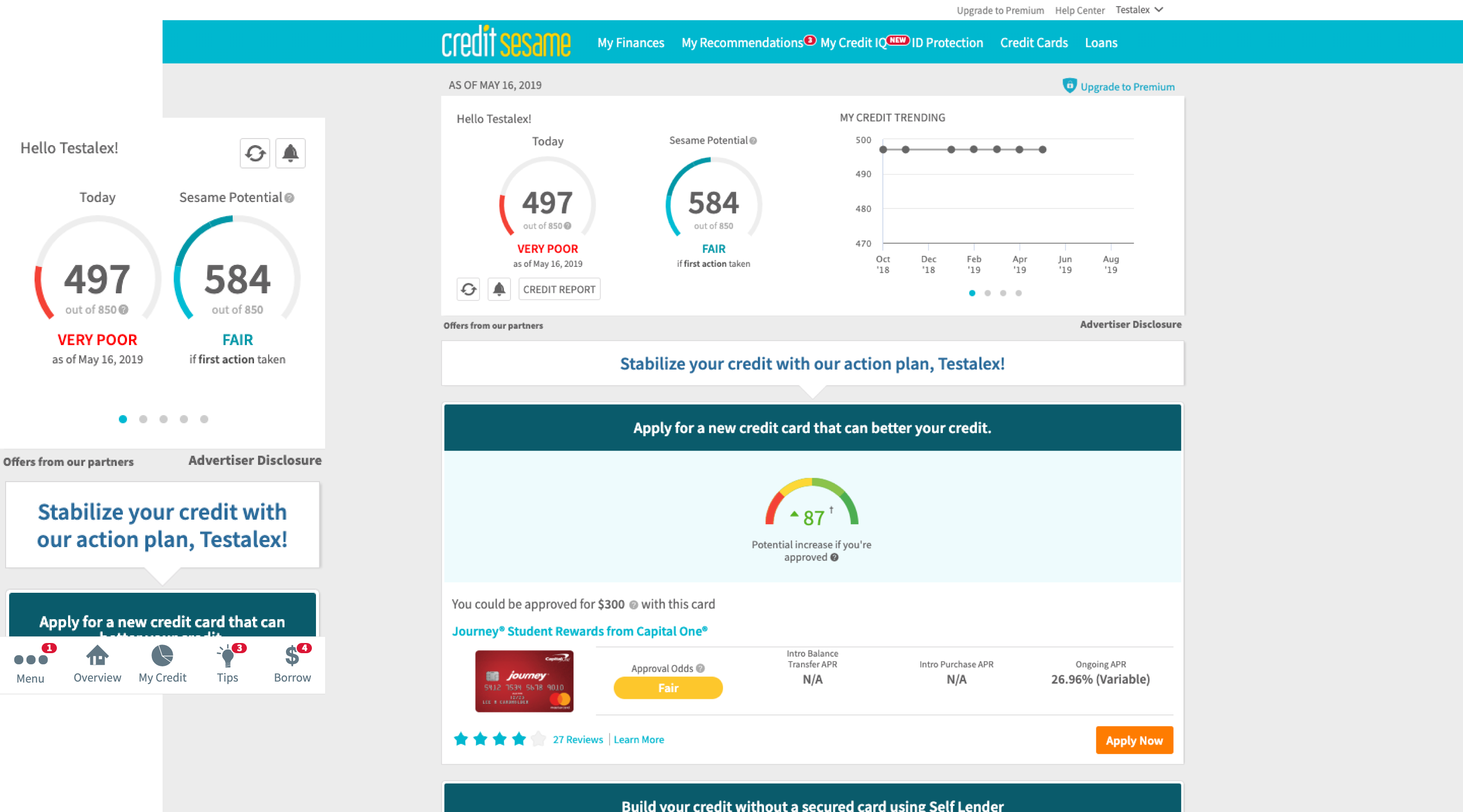
Unfortunately, Credit Sesame’s existing web app causes a lot of pain to users. They are often frustrated that the app focuses too much on selling credit cards, which leads to mistrust. Moreover, product teams have primarily optimized only the overview page to generate more revenue because the data shows low engagement on other pages.
While the existing web app meets the business needs, it overlooks the user needs.
To address the user needs, we chatted with our UX Researcher who has done extensive research on the existing web app. We learned that both first-time and returning users have similar needs. They want to know:
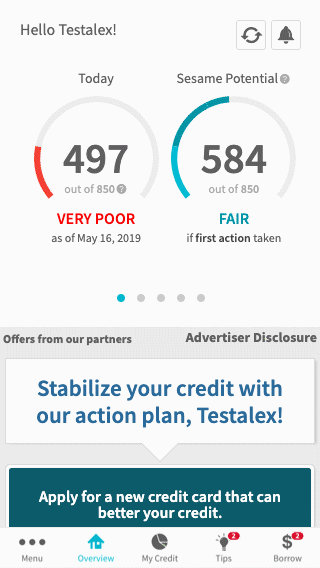
We also learned that on mobile web, the engagement on other internal pages was low due to a usability issue. This led to 2 navigation paths that users tend to take, and both paths only partially address their needs:

Prior to the start of this project, I had begun auditing components across platforms to consolidate and formally create a design system. Because we were designing from scratch, this project became an opportunity to build out a reusable component library for the web app that reflected the new rebrand. To ensure consistency on both design and engineering, I documented the foundations and components. You can read more about my responsibilities in Design Systems.
Keeping the UX Researcher‘s insights and recommendations in mind, we first began rethinking the information architecture. We identified pages that could be merged, and conducted several tests. From our user testings with 29 participants, we learned:
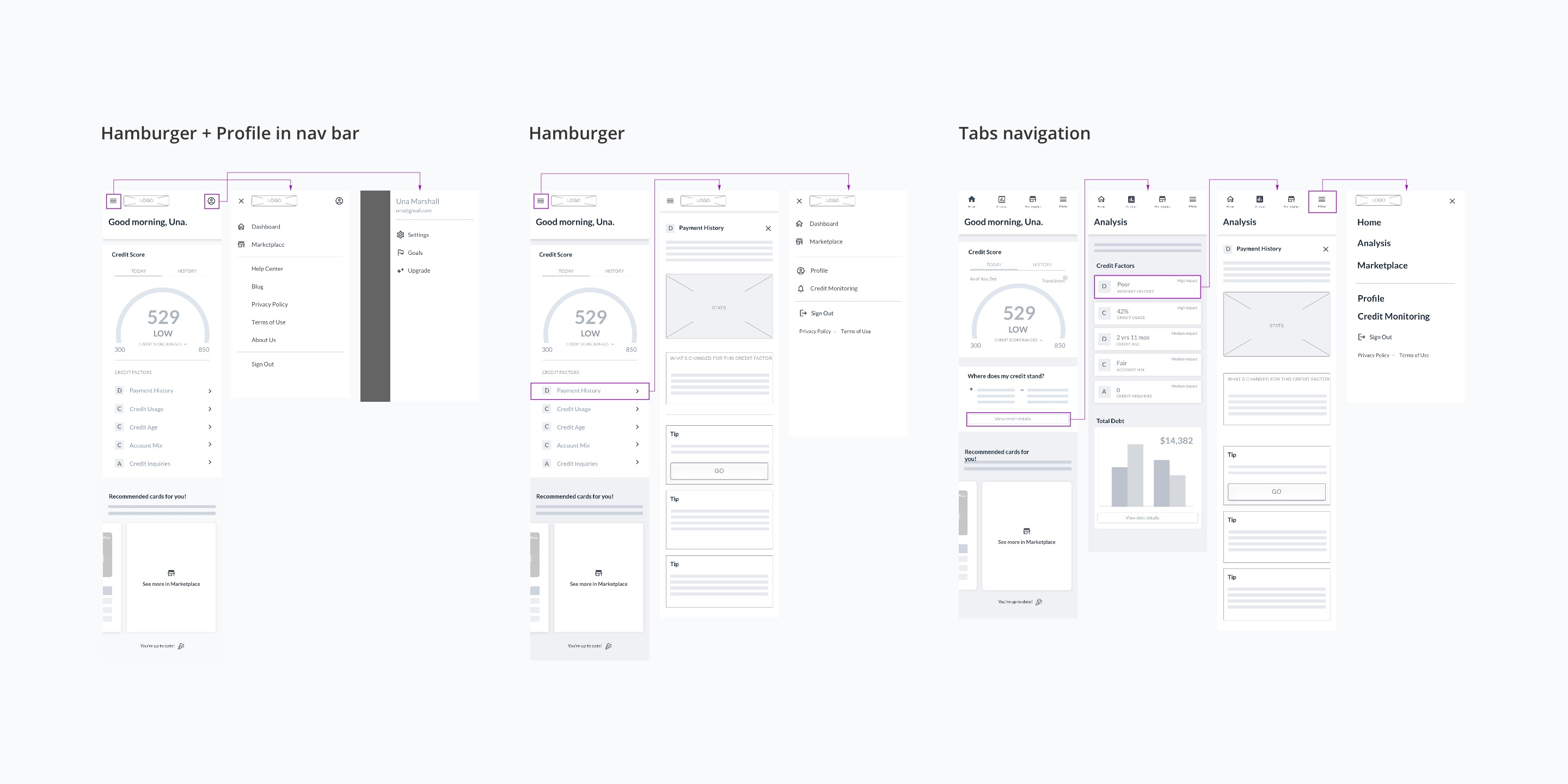
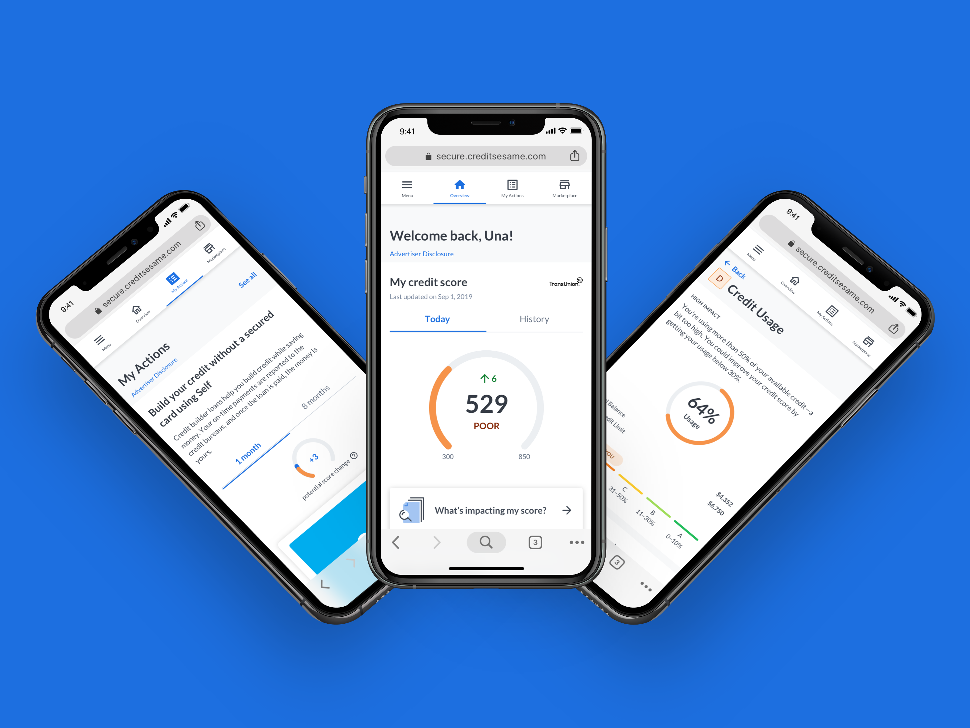
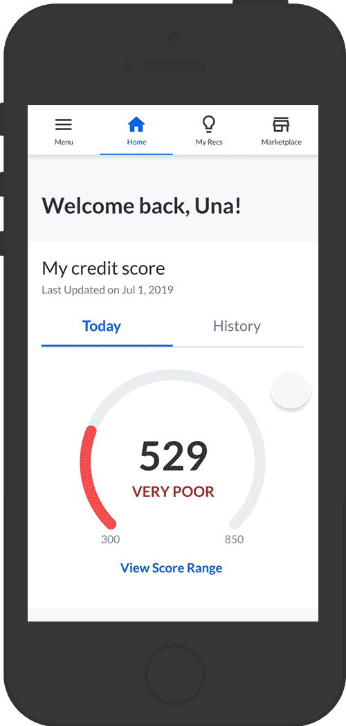
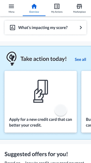
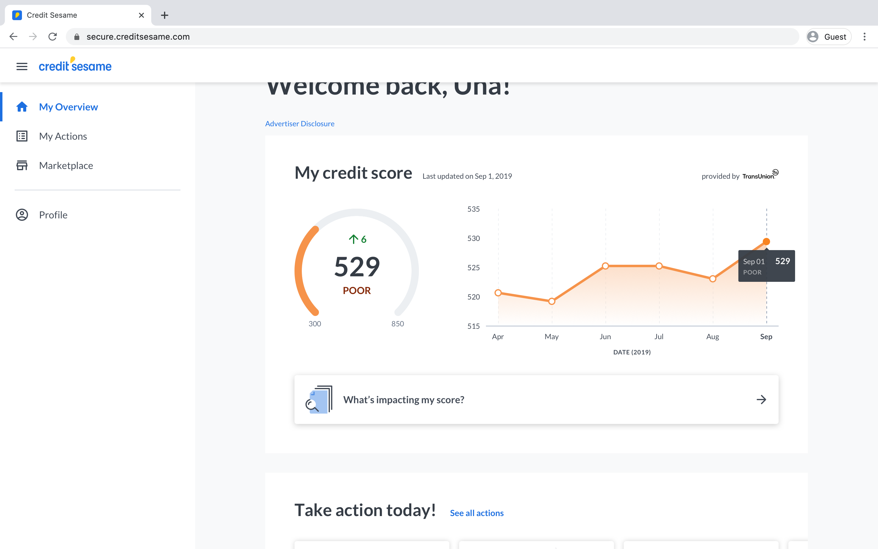
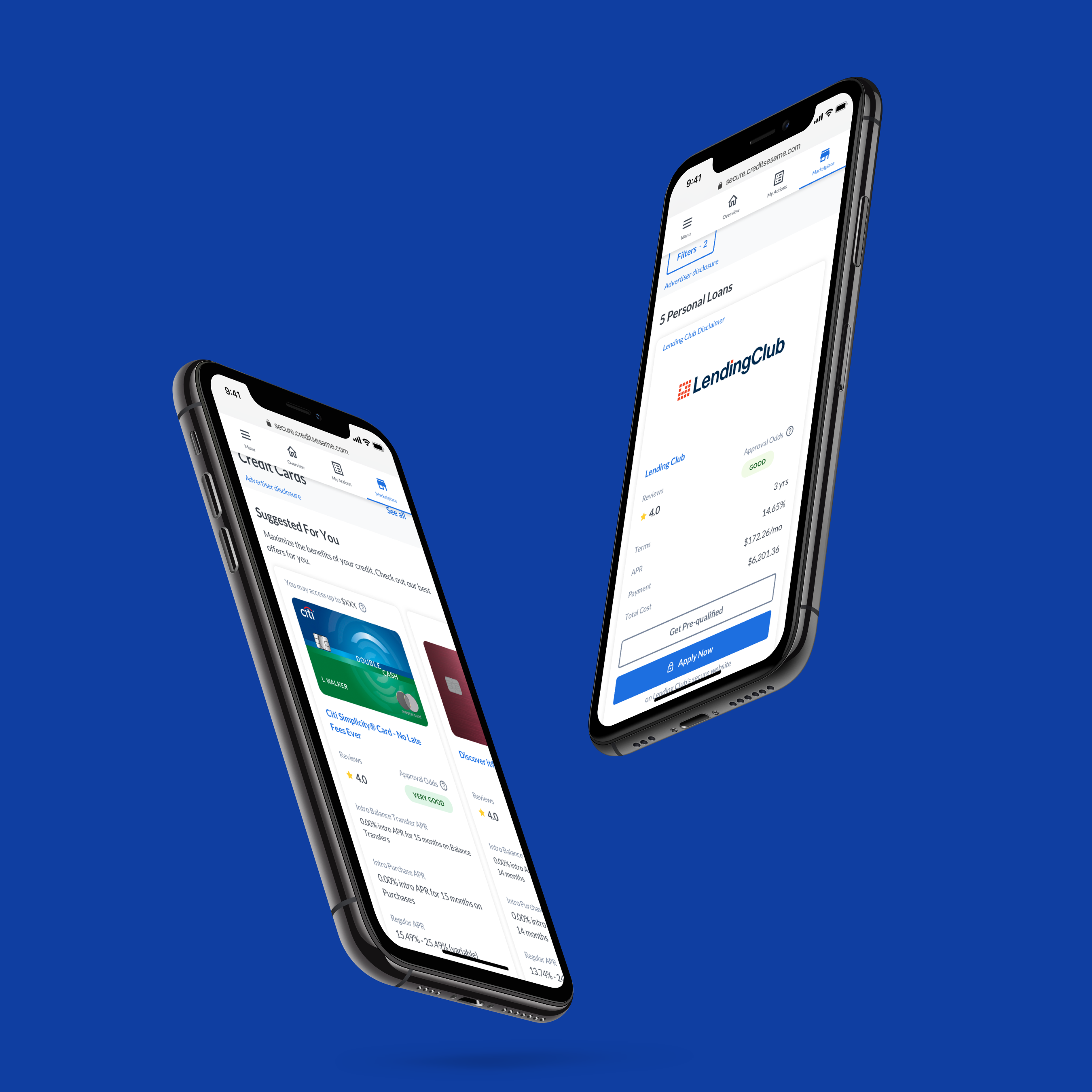
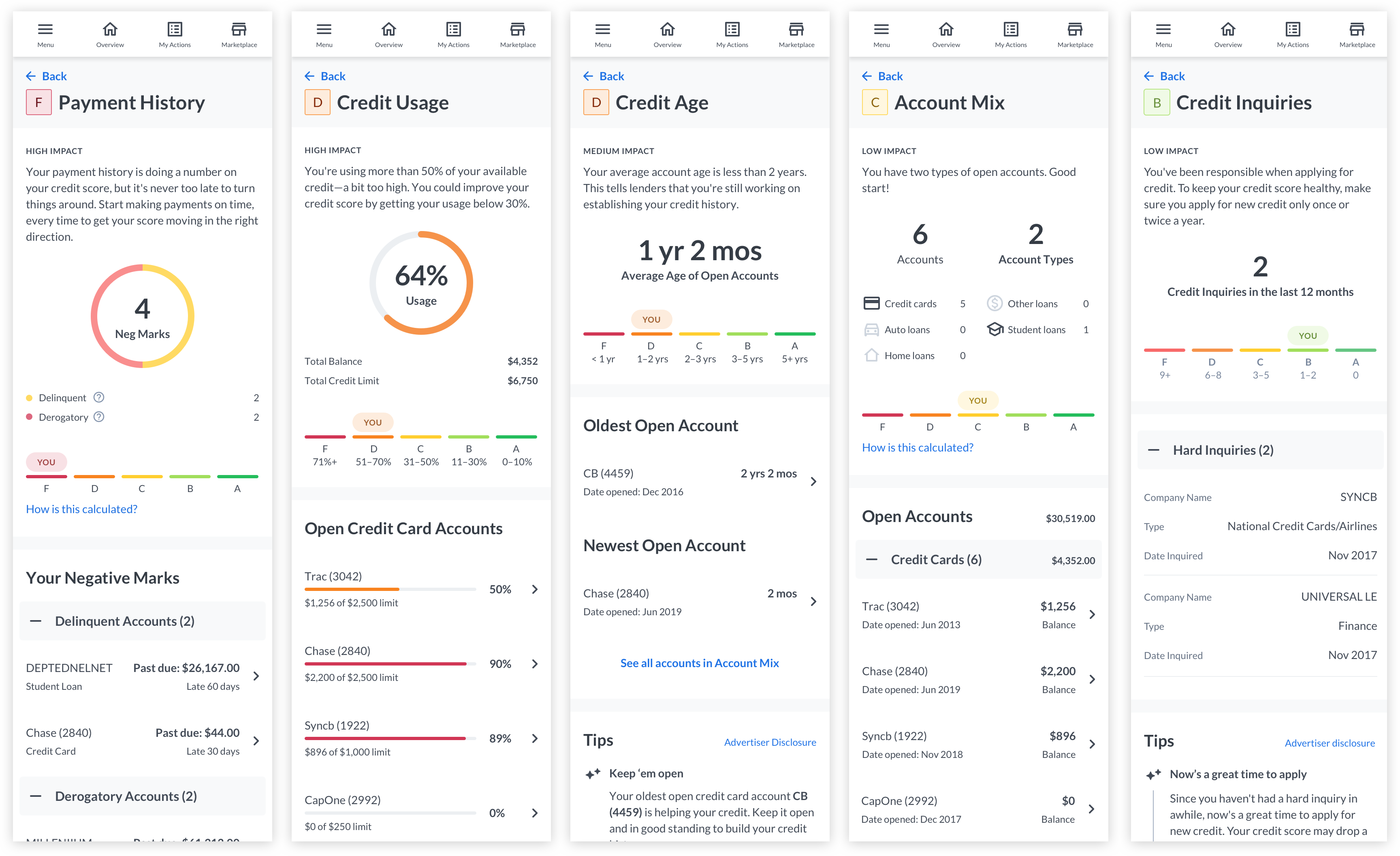
Based on our learnings, I created mid-fidelity mocks with a tab navigation and displayed credit factors on Overview. This decision also reduced the number of clicks for the user. Laying out the information on Overview immediately addresses the questions: “What is my credit score?” and “What’s impacting my score?”
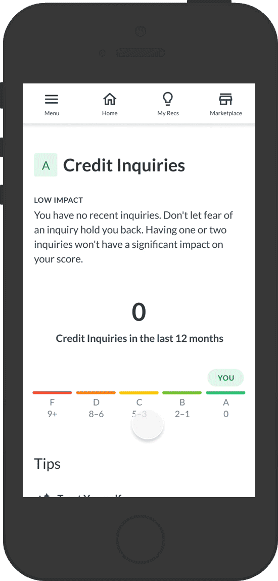
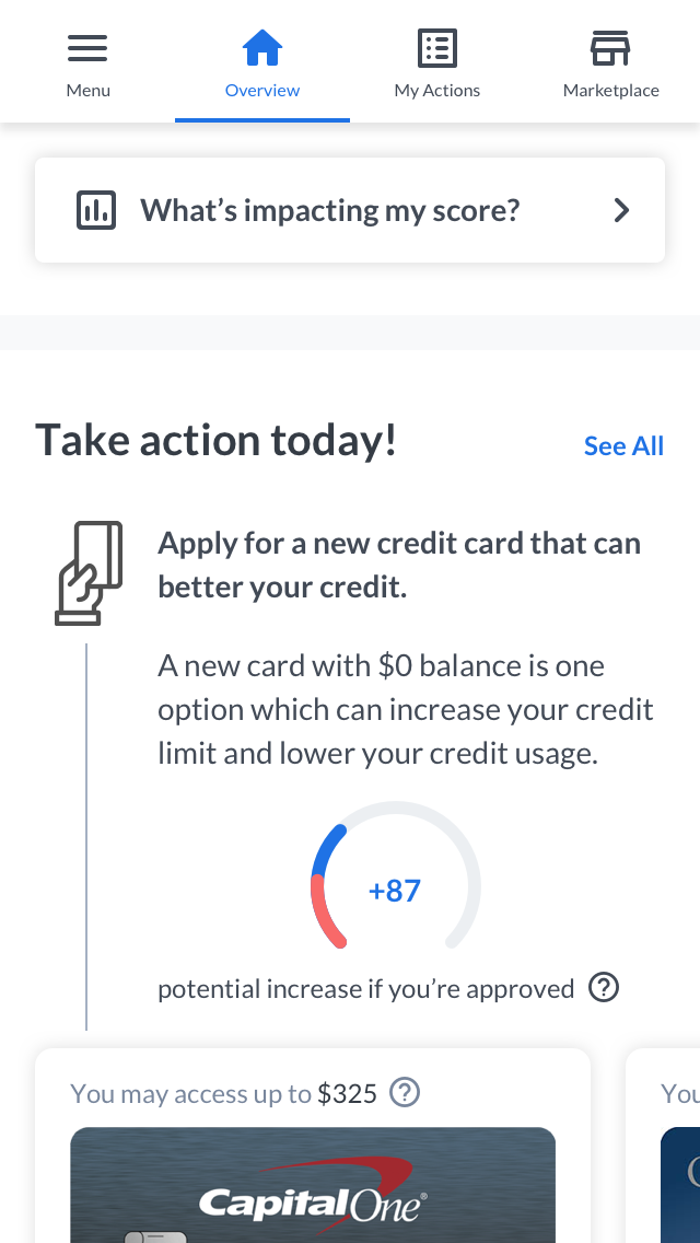
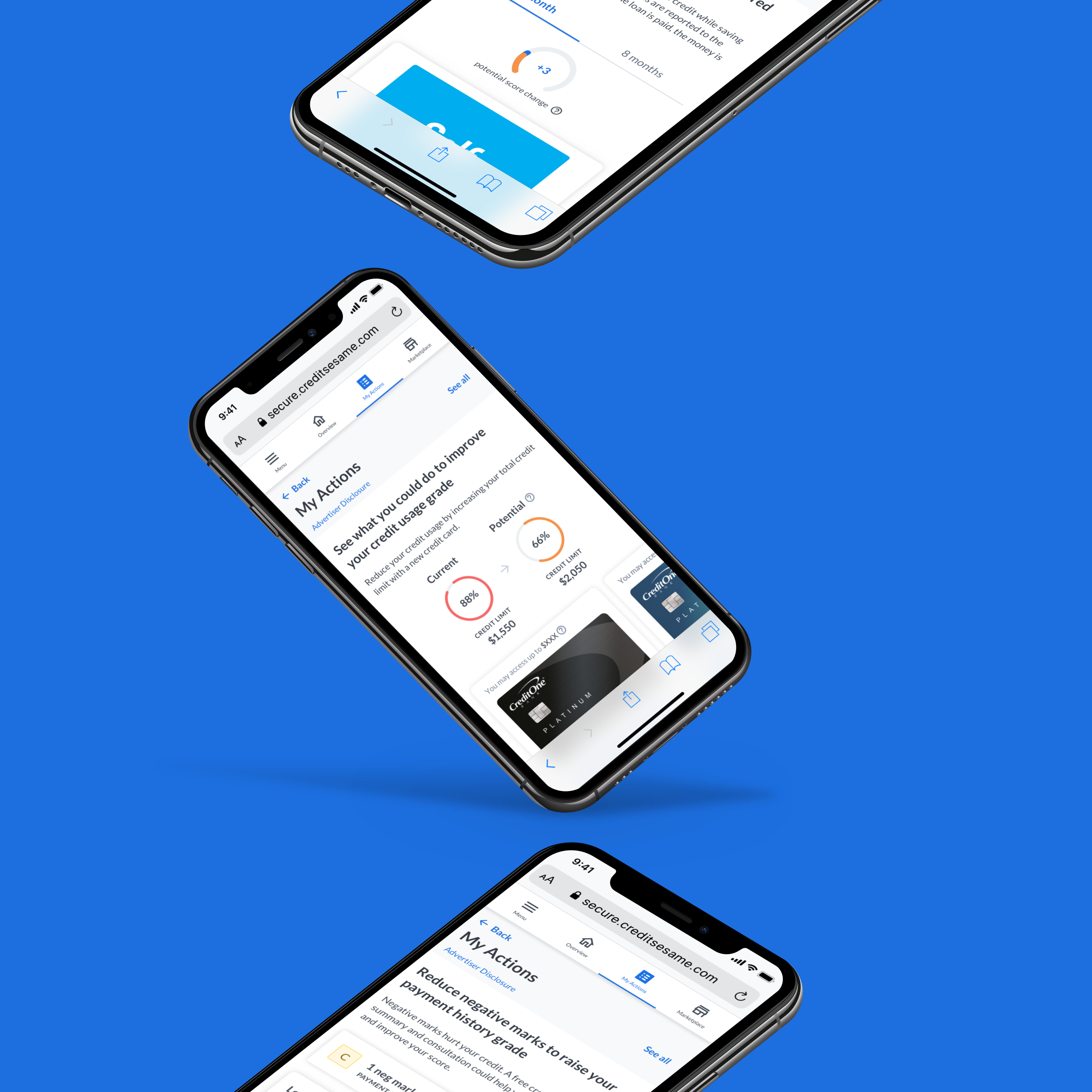
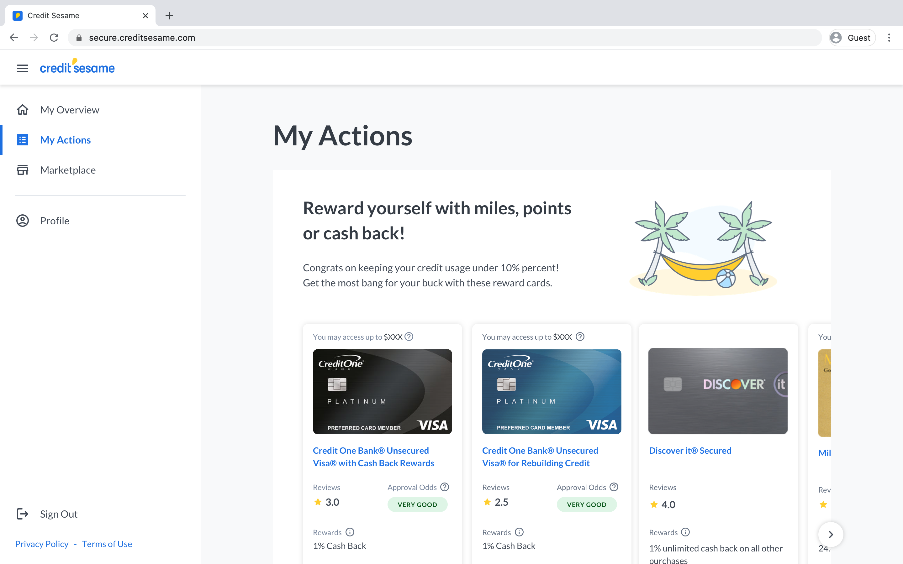
We addressed “what can I do [to improve my score]?” by having tips/actions within each credit factor page. We hypothesized users would most likely take action once they have context.
Because tips/actions are often tied with offers from our partners (this is how the company gains revenue), internal folks raised concerns that the lack of actions on the overview page might negatively impact revenue. We needed to figure out how to balance user and business needs, so we revisited our designs.
After some explorations, I created two prototypes—option A: Overview with multiple actions and option B: Overview with one action displaying offers—for a usability test. Based on the test results, option A caused less confusion than option B. Option A also piqued the participants’ curiosity, and users clicked on each action to learn more.
I wish I could say that we followed this framework for all the features scoped for MVP, but unfortunately we were met with many hurdles.
About a month into the project, leadership felt the team was making too many changes, and became doubtful of the success this project would bring. As a team, we quelled those doubts by relentlessly advocating that what we were doing was in the best interest of the user. We also advocated that our primary KPI, retention, would bring in just as much revenue, if not more.
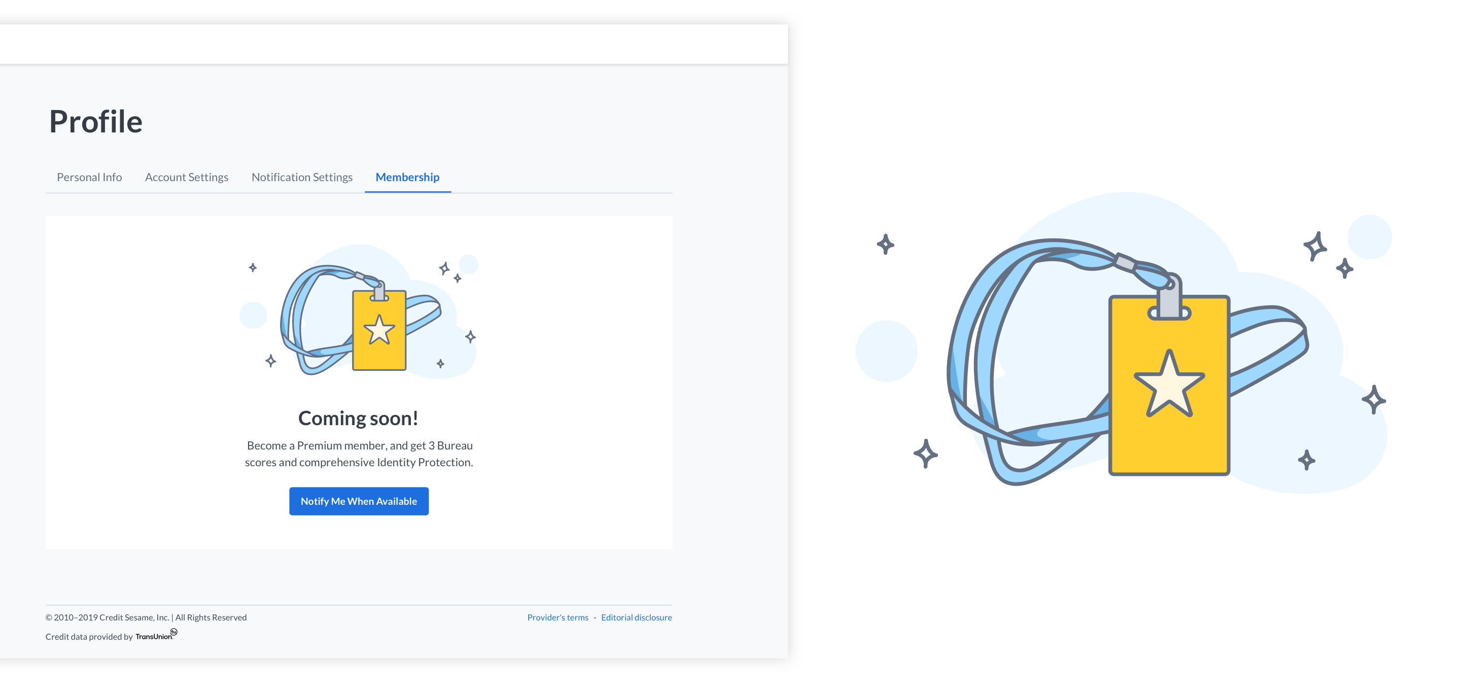
We requested hiring an illustrator to assist us in creating an illustration system that reflects the new brand, but this never came to fruition. Realizing that we would need to take matters into our own hands, I facilitated conversations in defining our illustration style. Even though I illustrated a few pieces, I let my co-designer create most of the illustrations because of her expressed interest, and to give her the opportunity to harness her skills.
The team was working in 1-week sprint cadences, and development often caught up with product and design. I was responsible for wireframing and designing mid-fidelity mocks to check if the overall experience makes sense. However, the demand to churn out mocks prevented me from evaluating and testing majority of the designs. We requested a dedicated UX Researcher but to no avail. I acknowledged our shortcomings, and created a list of features and pages to revisit post-MVP launch.
The lack of time also prevented me from clearly outlining the expected interactions in our initial handoffs. To fill in the gaps, I created a prototype using Figma and mapped out the entire MVP user flow. These assets helped engineering and QA better understand the redesigned experience.
Interact with Prototype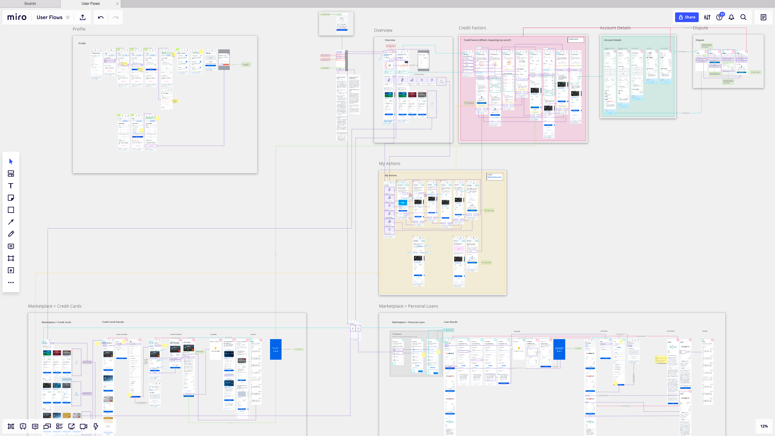
After 4 and a half months, the team shipped Credit Sesame 2.0 MVP in mid November 2019. We received positive feedback from our users, saying that the experience is intuitive, simple, and feels personalized. Comparing the redesign with the existing web app, we saw an increase:
+14%
+6.3%
+3%
Throughout this project, I learned there is a delicate balance between business and user needs. As a product designer, I need to acknowledge the business needs, otherwise it’s a constant battle to get buy-in from leadership.